Silky Szeto
司徒肇基
×
More Work

Unison Home Equity Sharing

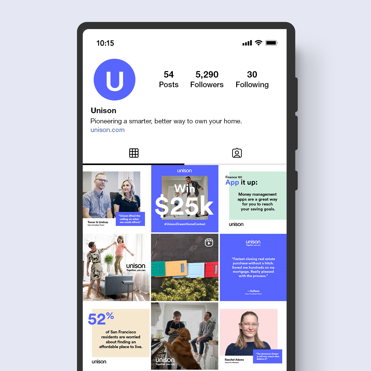
Brand Refresh & Campaign Launch: Together, you can.

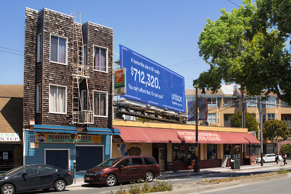
Unison is a leader in homeownership investment, an emerging category that can feel complex and unfamiliar. They needed a refreshed identity that brought simplicity and clarity to their offering. We helped redefine the brand while supporting a major digital lift to create an intuitive web experience and developing their first integrated campaign.

Roles:

Art Direction Concept Development Integrated Campaign TV OOH Social Campaign Brand & Visual Identity Logo Design Website Design
Unison logo design by Silky Szeto

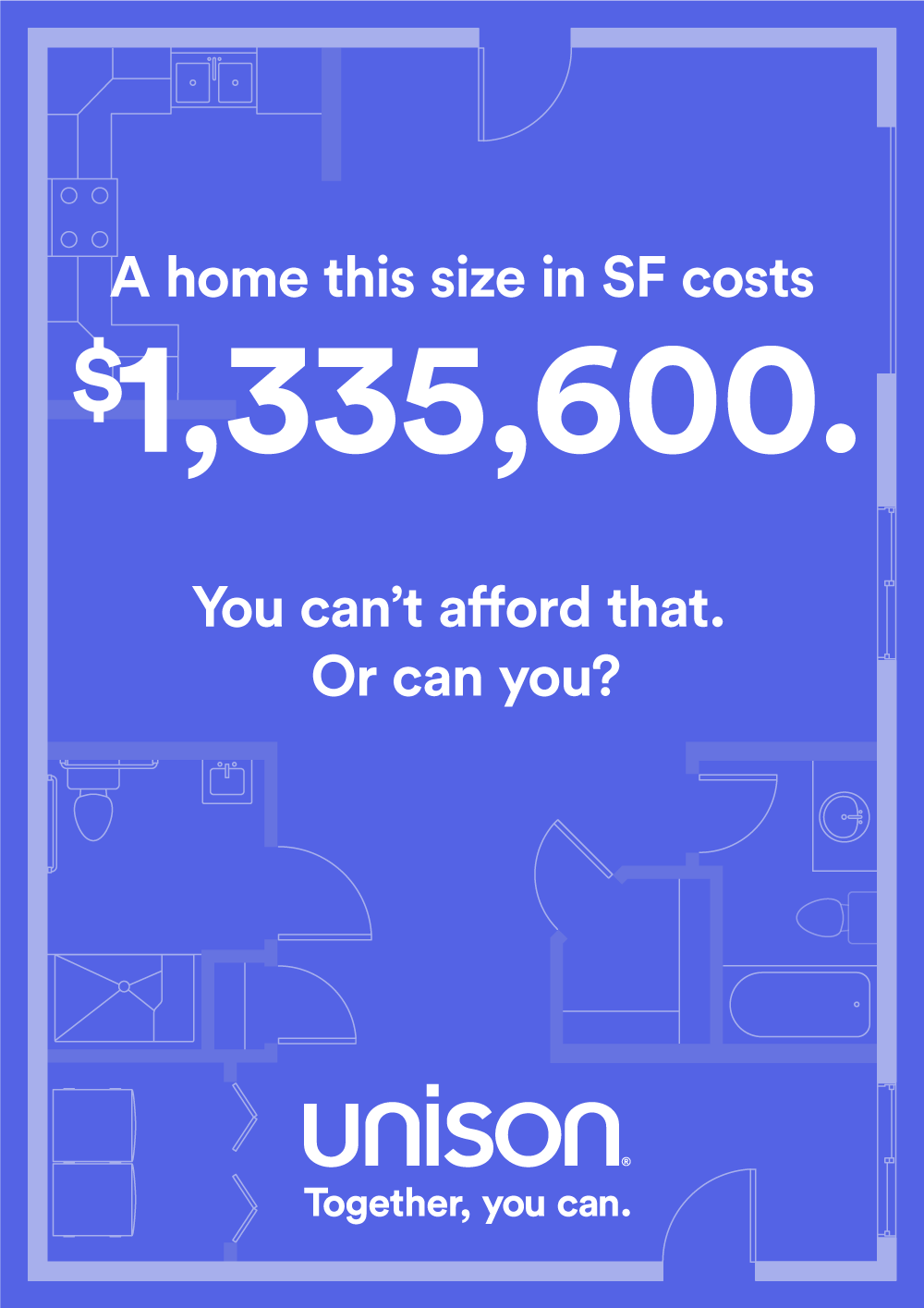
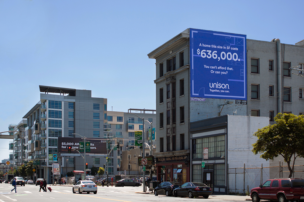
Home prices had skyrocketed, making ownership feel out of reach. With zero brand awareness and a brand-new category to explain, Unison needed to quickly earn trust and educate customers on a complex offering. Their platform had to simplify unfamiliar information and drive real business results.

People often feel like they're facing the housing market alone. But homeownership becomes more attainable when you have a partner who shares the risk and removes the barriers. We can always go further together than alone.

We reframed Unison's offering around partnership with the idea that "Together, you can." This shifted the story from financing to shared opportunity. The creative direction brought this to life with a brand built on simplicity, transparency, and accessibility. Clean typography, clear hierarchy, and intuitive layouts reinforced how Unison helps remove the barriers to owning a home.

Tablet showing the Unison account sign-in screen next to a photo of a home entryway.

Doors TV Spot

To kick off the campaign, we created a bold, playful TV commercial that brought Unison's mission to life by knocking down the daunting challenges of homeownership. We turned that idea into a giant domino course of falling doors across San Francisco, symbolizing the barriers Unison helps remove.

Logo Design

The original logo used an open door to symbolize accessibility, but the complexity of the design created confusion, and many customers read it as "Uni Son" instead of "Unison." We refreshed the logo for greater clarity and simplicity, using a custom typeface inspired by Avenir.

Unison logo design featuring clean, modern typography with a simplified wordmark replacing the previous complex door logo
Unison logo design process showing custom typography exploration
Animated Unison logo demonstrating the brand mark in motion
Unison logo design process showing floor plan inspiration and architectural elements that influenced the final wordmark
Unison brand guidelines document showing logo usage, typography, color palette, and visual identity standards
Unison brand guidelines for iconography and illustrations
Unison social media template designs showing Instagram post layouts with consistent brand styling
Unison report cover design featuring clean typography and minimalist layout reflecting the brand's simplicity

Digital-First Identity

The identity was designed digital-first, with the website as the primary expression of the brand. Accessibility principles shaped the typography, color, and hierarchy to make complex information easier to scan and understand across devices. The result is a clear and intuitive web experience that brings greater simplicity to an unfamiliar category.

Unison website design showing the digital-first identity with accessible typography, clear hierarchy, and intuitive navigation

Brand Campaign

We turned the actual square footage of billboard spaces around San Francisco into a striking commentary on the city's housing market, showing how much a home of that size would cost.

Unison billboard advertisement design
Photography of Unison billboard advertisement in San Francisco